Фиксированная верхняя панель (sidebar) для сайта с функцией скрыть/показать.
Если вам интересует всплывающая боковую панель, то ее вы можете найти по этой ссылке.
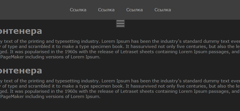
Верхняя панель: демо
Ниже представлено демо, где вы можете посмотреть как верхняя выдвигающая панель будет выглядеть в живую. Посмотреть в полный экран можно по этой ссылке.
HTML
Обычный HTML каркас. Меню сверху и нижний контейнер, будут 100% в ширину. Изначально меню показывается.
<div id="navigation-top">
  <div class="show_hide">
    <span class="bar"></span>
    <span class="bar"></span>
    <span class="bar"></span>
  </div>
  <nav id="nav-top">
    <ul class="menu">
      <li><a href="#">Ссылка</a></li>
      <li><a href="#">Ссылка</a></li>
      <li><a href="#">Ссылка</a></li>
      <li><a href="#">Ссылка</a></li>

    </ul>
  </nav>
</div>
<main class="container-inner">
  <h1>Заголовок контенера</h1>
  <p>Lorem Ipsum is simply dummy text of the printing and typesetting industry. Lorem Ipsum has been the industry's standard dummy text ever since the 1500s, when an unknown printer took a galley of type and scrambled it to make a type specimen book. It
    hassurvived not only five centuries, but also the leap into electronic typesetting, remaining essentially unchanged. It was popularised in the 1960s with the release of Letraset sheets containing Lorem Ipsum passages, and more recently with desktop
    publishingsoftware like Aldus PageMaker including versions of Lorem Ipsum.</p>
</main>
CSS
Верхняя панель и контейнер имеют 100% ширину. И конечно же я добавил дополнительные стили, чтобы немного приукрасить меню и все элементы на странице.
* {
  margin: 0;
  padding: 0;
  -webkit-box-sizing: border-box;
  -moz-box-sizing: border-box;
  box-sizing: border-box;
  -webkit-transition: background-color 0.5s ease-in-out;
  -moz-transition: background-color 0.5s ease-in-out;
  -webkit-transition: all 0.5s ease-in-out;
  -moz-transition: all 0.5s ease-in-out;
}

body {
  font-size: 11pt;
  font-family: Verdana, Tahoma, sans-serif;
  color: #8F8F8F;
  background-color: #212121;
}

.container-inner {
  padding: 20px;
}

.container,
#navagation-top {
  display: block;
  float: left;
}

#navigation-top {
  background-color: #3E3E3E;
  position: relative;
}
#navigation-top .show_hide {
  width: 30px;
  height: 27px;
  position: absolute;
  bottom: -27px;
  left: 50%;
  margin-left: -15px;
  background-color: #3E3E3E;
  padding: 2px;
  cursor: pointer;
}
#navigation-top .show_hide .bar {
  width: 100%;
  margin-bottom: 5px;
  height: 4px;
  background-color: #797979;
  display: block;
}
#navigation-top, #navigation-top nav {
  width: 100%;
}
#navigation-top ul, #navigation-top nav ul {
  display: table;
  margin: 0 auto;
}
#navigation-top ul li, #navigation-top nav ul li {
  display: inline-block;
}
#navigation-top ul li a, #navigation-top nav ul li a {
  padding: 10px 20px;
  text-decoration: none;
  color: #AFADAD;
  display: block;
  min-height: 50px;
  line-height: 50px;
}
#navigation-top ul li a:hover, #navigation-top ul li a:active, #navigation-top ul li a:focus, #navigation-top nav ul li a:hover, #navigation-top nav ul li a:active, #navigation-top nav ul li a:focus {
  background-color: #4E4E4E;
}

.container-inner h1 {
  margin-bottom: 10px;
}
.container-inner p {
  margin-bottom: 20px;
}
jQuery
В скрипте ниже есть только одна функция — это toggleMenuTop(). Она подключается, в случае нажатия на кнопку «гамбургер» вверху сайта.
Так как мы знаем, что изначально меню показывается пользователю — тем самым класс closed не будет добавлен. Если closed класса на #navigation-top нет, то убираем меню на минусовой margin и добавляем класс closed. В противном случае, убираем style атрибут, в котором прописан margin, а так же удаляем класс closed.
$(function() {
  $(document).ready(function() {
    $('.show_hide').click(function() {
      toggleMenuTop();
    });
  });
});

function toggleMenuTop() {
  var $nav = $('#navigation-top');

  if ($nav.hasClass('closed')) {
    $nav.removeAttr('style').removeClass('closed');
  } else {
    $nav.css({
      'margin-top': -$('#navigation-top').height()
    }).addClass('closed');
  }
}
На этом все. Если у вас остались какие-либо вопросы — пишите их ниже под этой записью — я буду рад вам помочь.